Choosing fabric online is never easy — especially when it comes to color. The light on your screen, the photo settings, even your own imagination… everything can influence how you perceive a color. And when you're creating a collection, designing a garment, or building a moodboard, even a small difference in tone can make a big impact.
That’s exactly why we introduced a new feature on our product pages:
the Pantone code of each fabric.
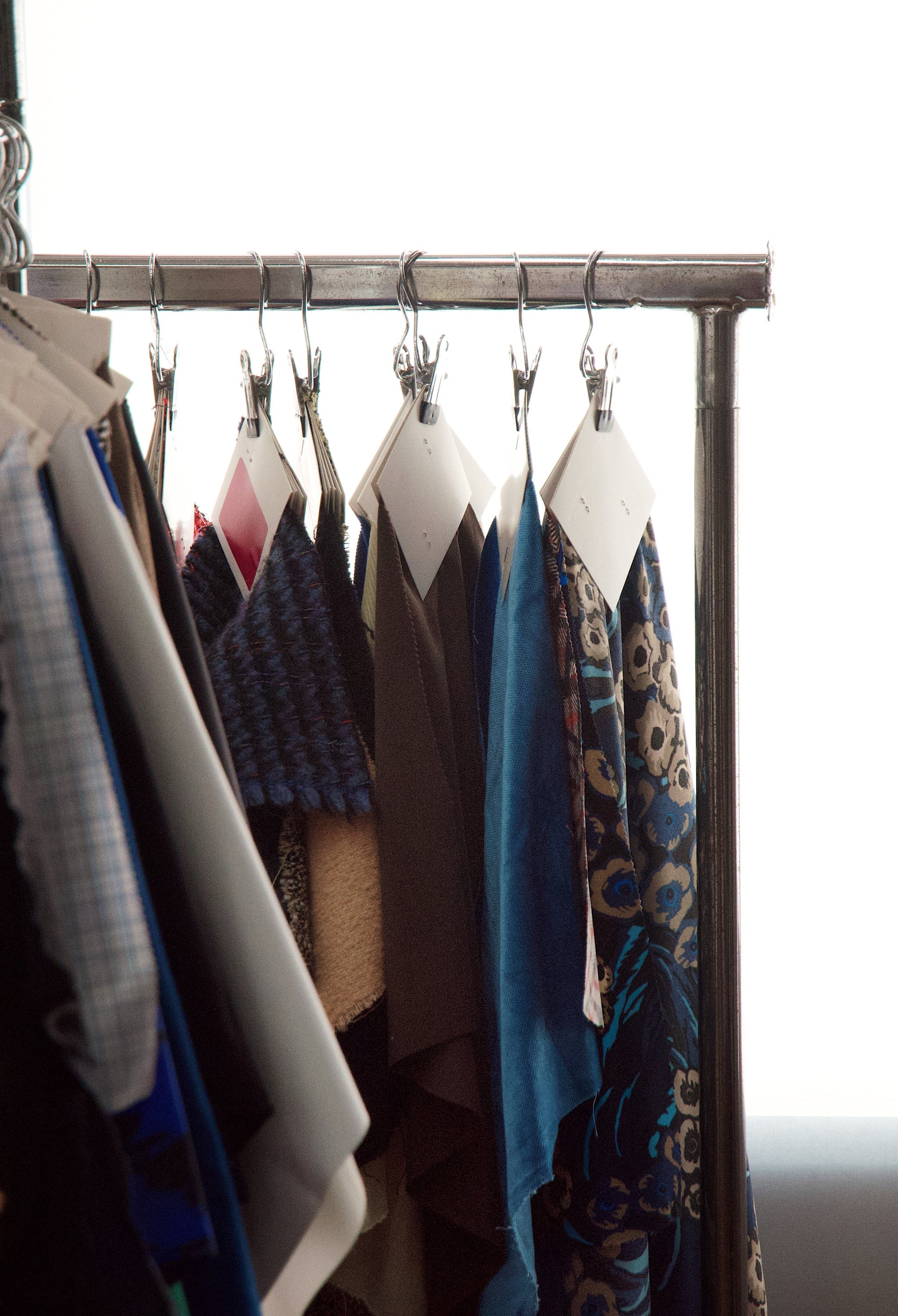
Until now, the Pantone reference was already visible in the product photos, carefully placed to help you get a sense of the exact shade. But we know that when you’re working fast, comparing options, or just scrolling through possibilities, it helps to have the information clearly written and easy to spot. So we added it directly into the technical specs — no need to zoom in or guess.
Because we believe that color isn’t just a detail — it’s a language.
With this update, we’re making your creative process even smoother. You’ll be able to match fabrics more confidently, integrate them easily into your digital palettes, and avoid surprises when the fabric arrives in your studio.
It’s all part of our mission to support responsible, inspired design — without compromise.
Whether you’re building your first capsule collection or finalizing a costume for the stage, we’re here to make sure every decision you take is informed, beautiful and yours.
Explore the fabrics, trust the color, and keep creating.


